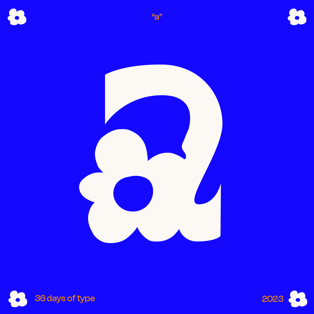
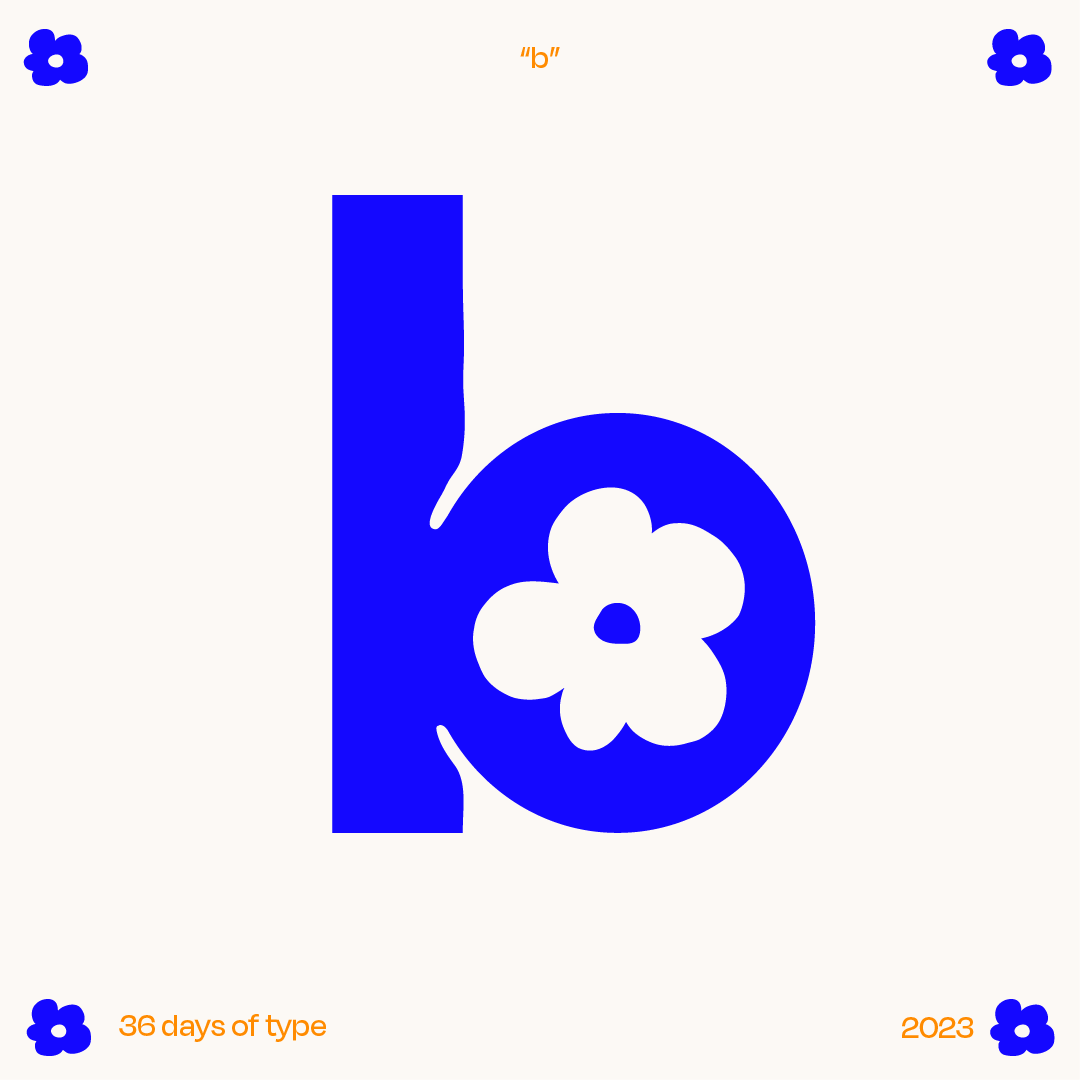
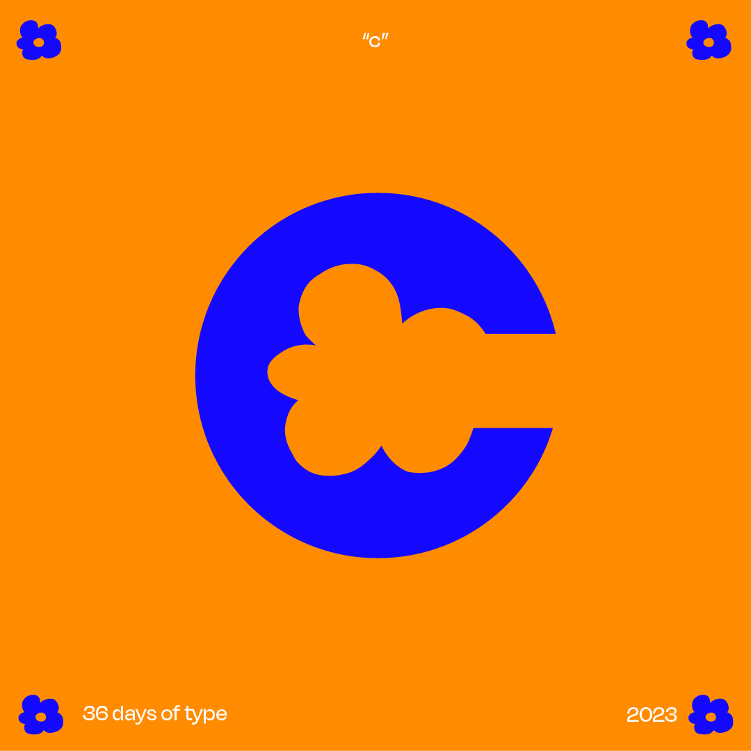
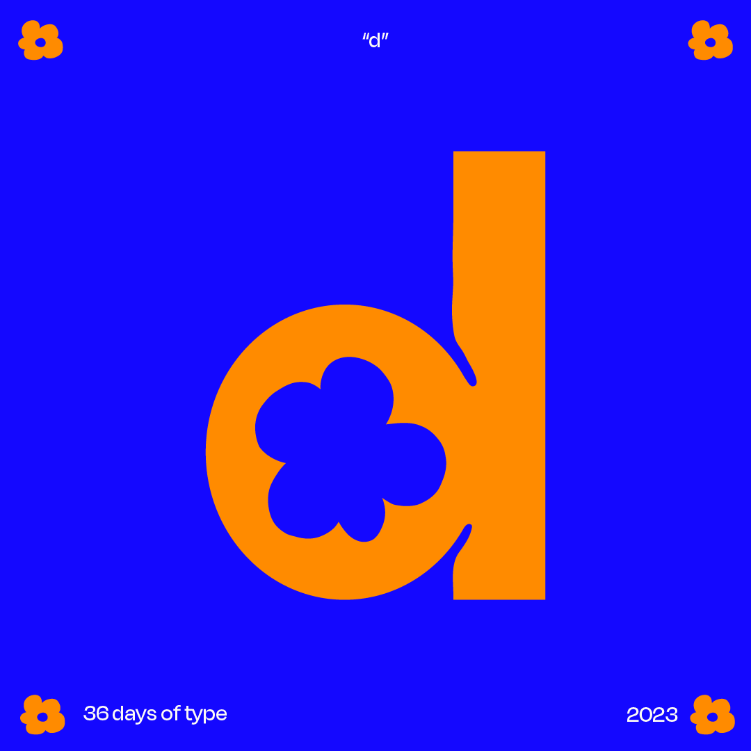
36 days of type
︎ ······· emerson lawton
︎ ······· type design
︎ ······· 2023
I’d been considering jumping into the 36 days of type challenge before, but it always seemed like such a huge time commitment (and type design is hard!!!). Last year I was able to complete 26/36 of the challenge...... over the course of about 6 months.
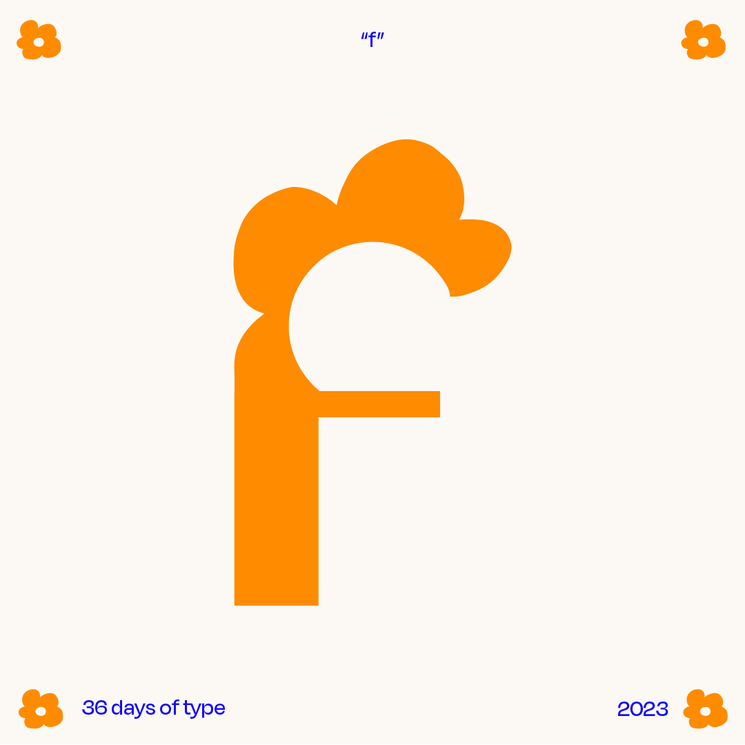
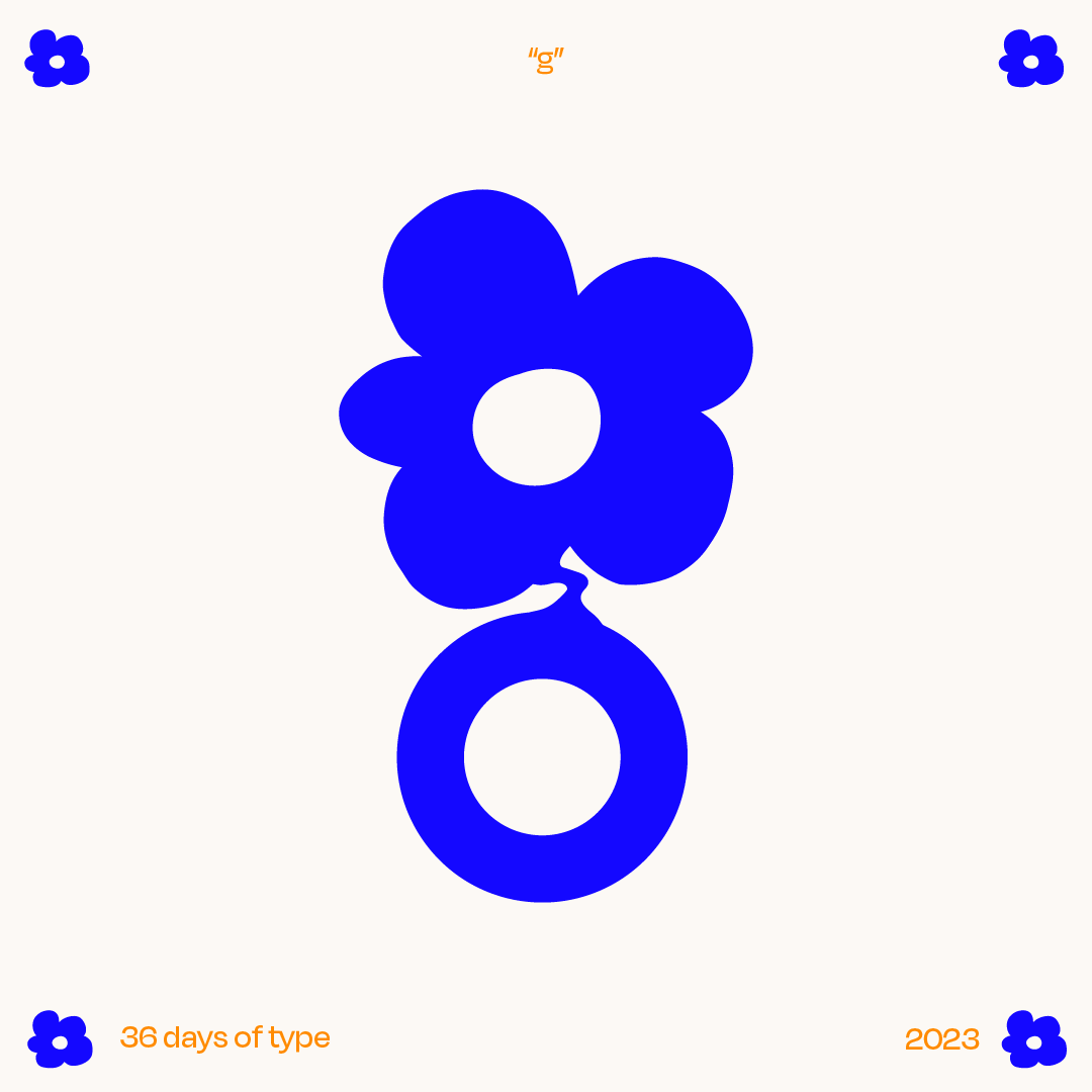
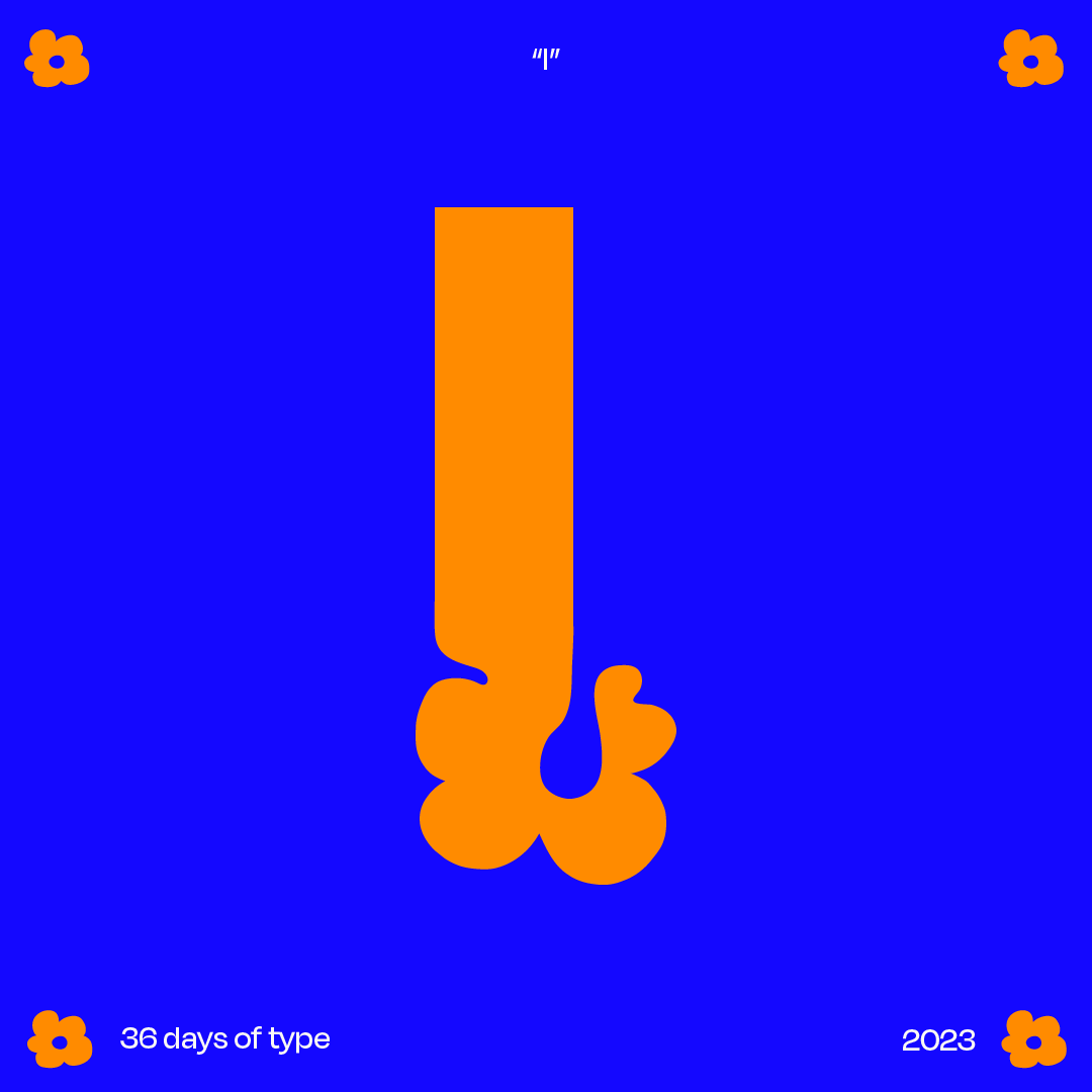
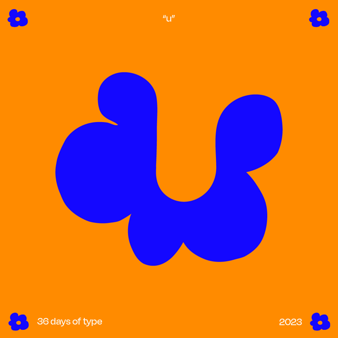
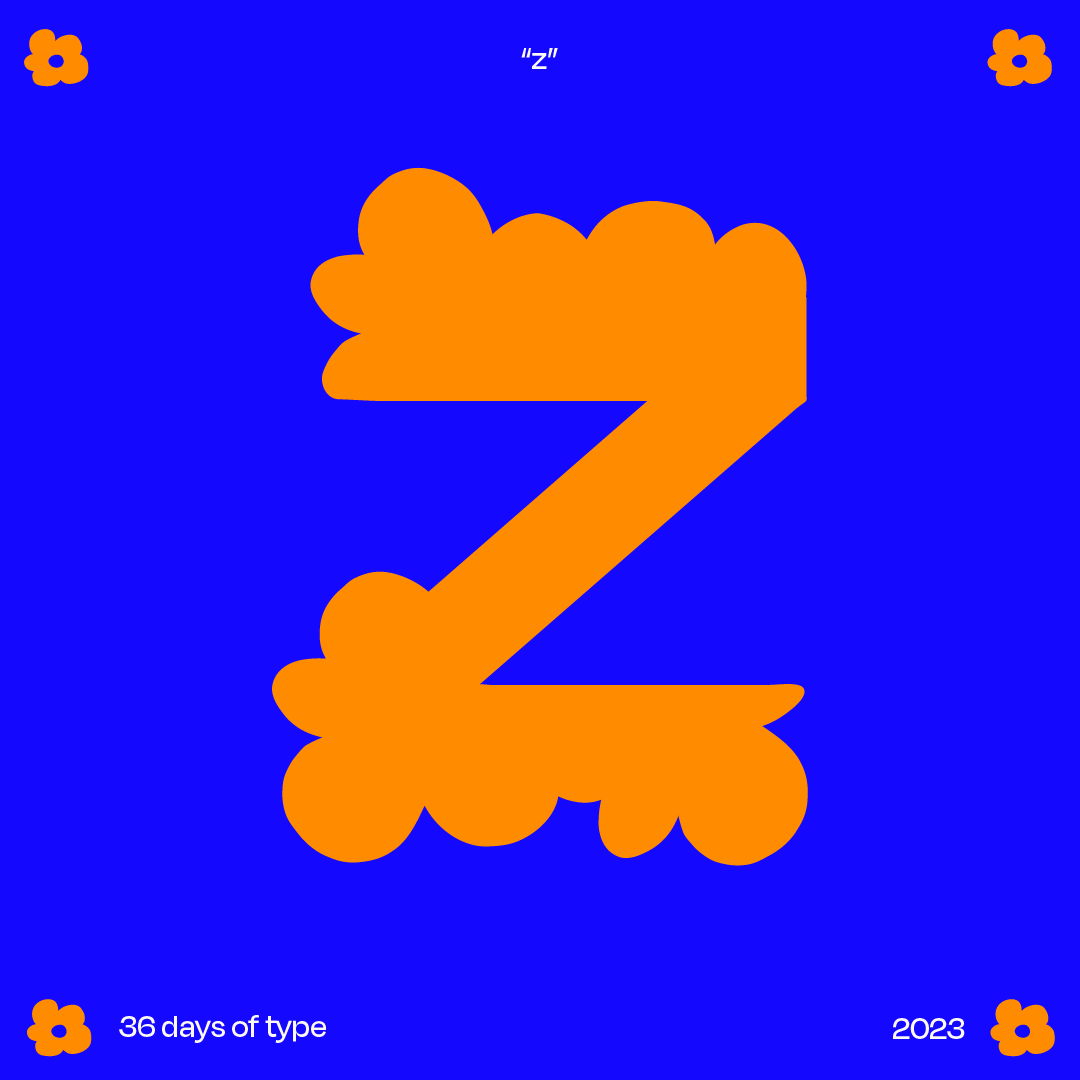
This typeface is currently unnamed but was inspired by the imperfection and playfulness found in nature in the spring. I based my forms off of a hand-drawn flower doodle and used that bubbly, wonky shape as a unifying element across the alphabet. This quickly became an exercise in flow and experimentation for me - I only allowed myself a short amount of time to work on each letter, and then I forced myself to shut my laptop and walk away, resulting in a fair amount of letters I was pretty frustrated with. On the whole, this flexed my type muscles in a way that got me excited to continue working with a looser, more experimental type style and got me excited for the next type design challenge (maybe this time I’ll get to the numbers too).
